BB – Quick Commerce App Design
Task
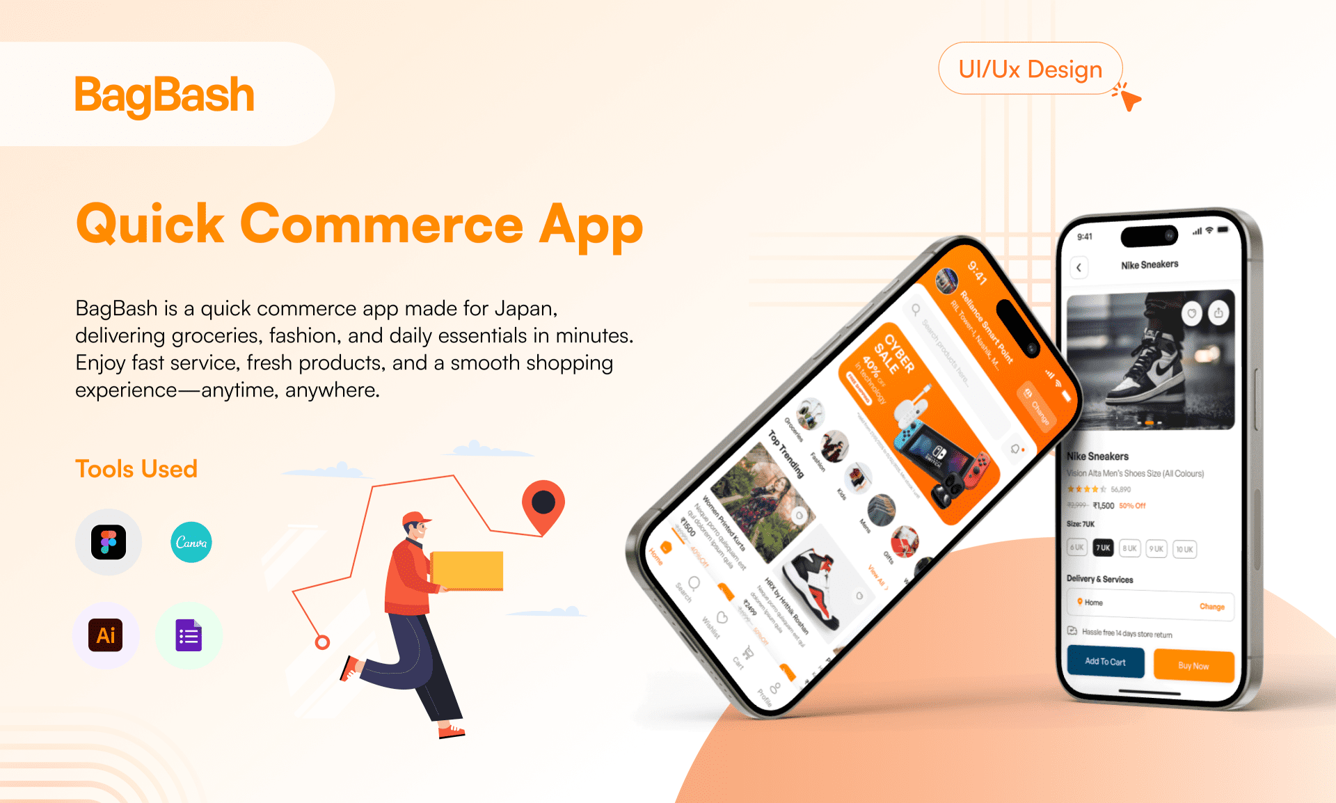
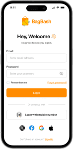
BB is a quick commerce mobile app built for the Indian and Japanese markets, offering rapid delivery of groceries, fashion, and daily essentials. Designed to meet Japan’s standards of convenience and India’s growing demand for speed and efficiency, BagBash ensures a seamless and reliable shopping experience.
Project Duration
90 Days
Target Market
India & Japan
Target Audience
Age: 20–45
Stakeholders
User, Delivery, Vendor, Store, Admin
Closing the Digital Gap
Japan’s quick commerce landscape is still dominated by offline shopping, with many established local stores and vendors yet to embrace digital platforms. Despite the growing demand for convenience, most big players remain offline-focused, missing the opportunity to serve customers who prefer fast, mobile-first experiences.
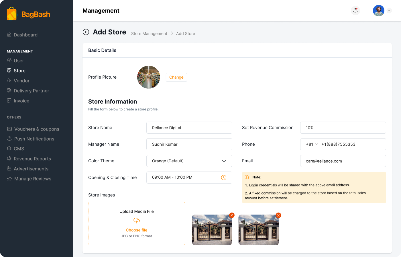
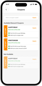
BB aims to bridge this gap by helping traditional vendors transition smoothly into the online space through a seamless, user-friendly app. To preserve the familiar charm of offline shopping, we introduced a “Shop & Earn Stamps” program—mirroring a popular offline strategy in Japan. With each purchase, users collect digital stamps, which can be redeemed for discount coupons, encouraging repeat purchases and building loyalty in a culturally familiar way.

Empowering Vendors, Engaging Customers
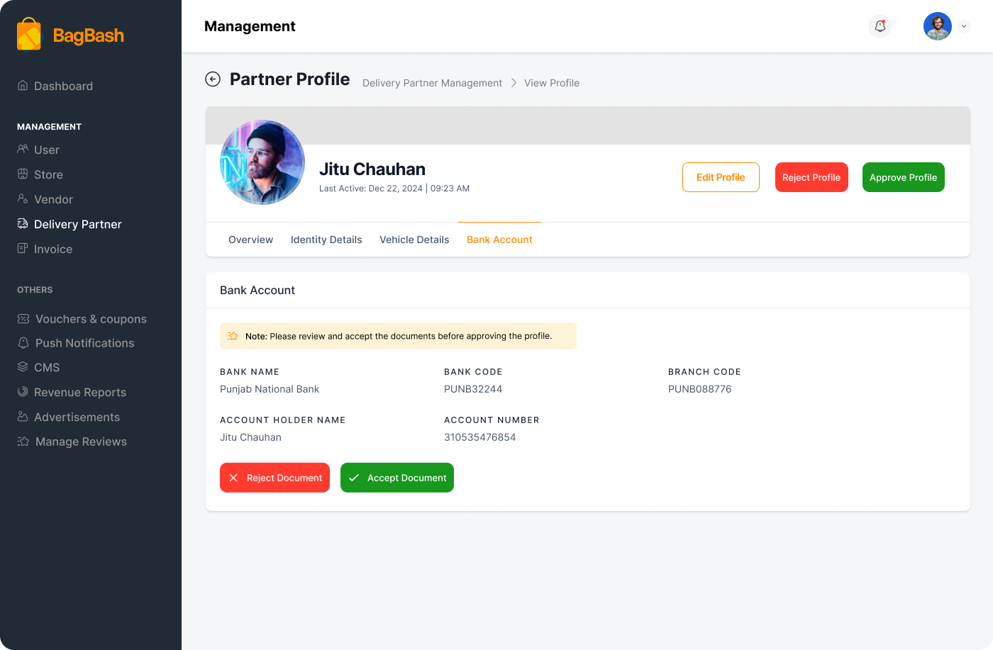
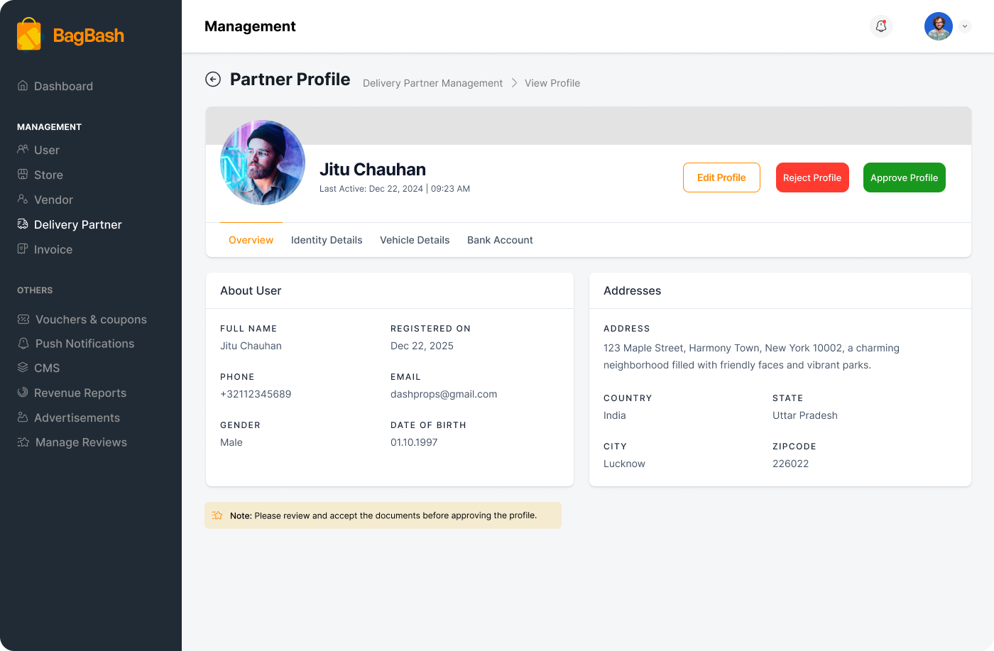
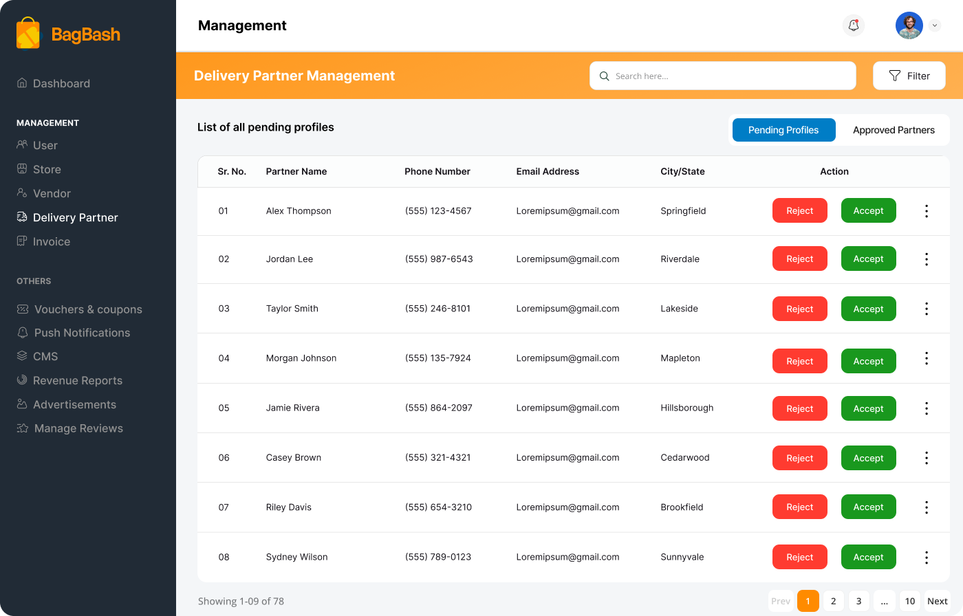
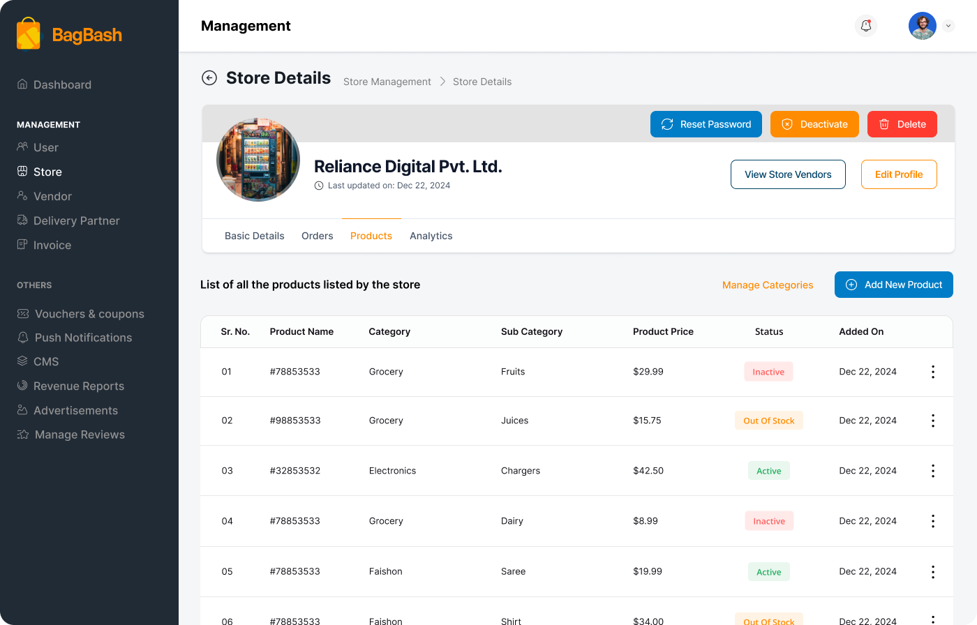
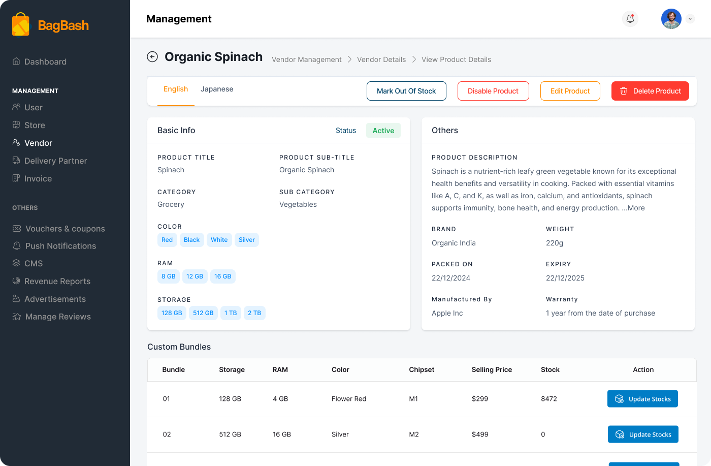
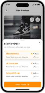
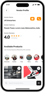
BB bridges this gap by providing an easy-to-use platform that helps local vendors transition online without complexity. It offers:
- Built-in inventory management tools to help vendors track and update their products easily.
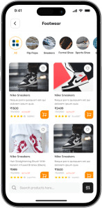
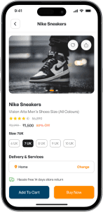
- A fast, mobile-first shopping experience for users.
- Real-time order tracking and instant delivery
To retain the charm of offline shopping, BB introduces a culturally familiar “Shop & Earn Stamps” loyalty program. With each purchase, users earn digital stamps, which they can redeem as discount coupons—mirroring the stamp cards used by many Japanese stores. This blend of tradition and technology helps drive both customer loyalty and vendor adoption, while transforming offline habits into an engaging online experience.
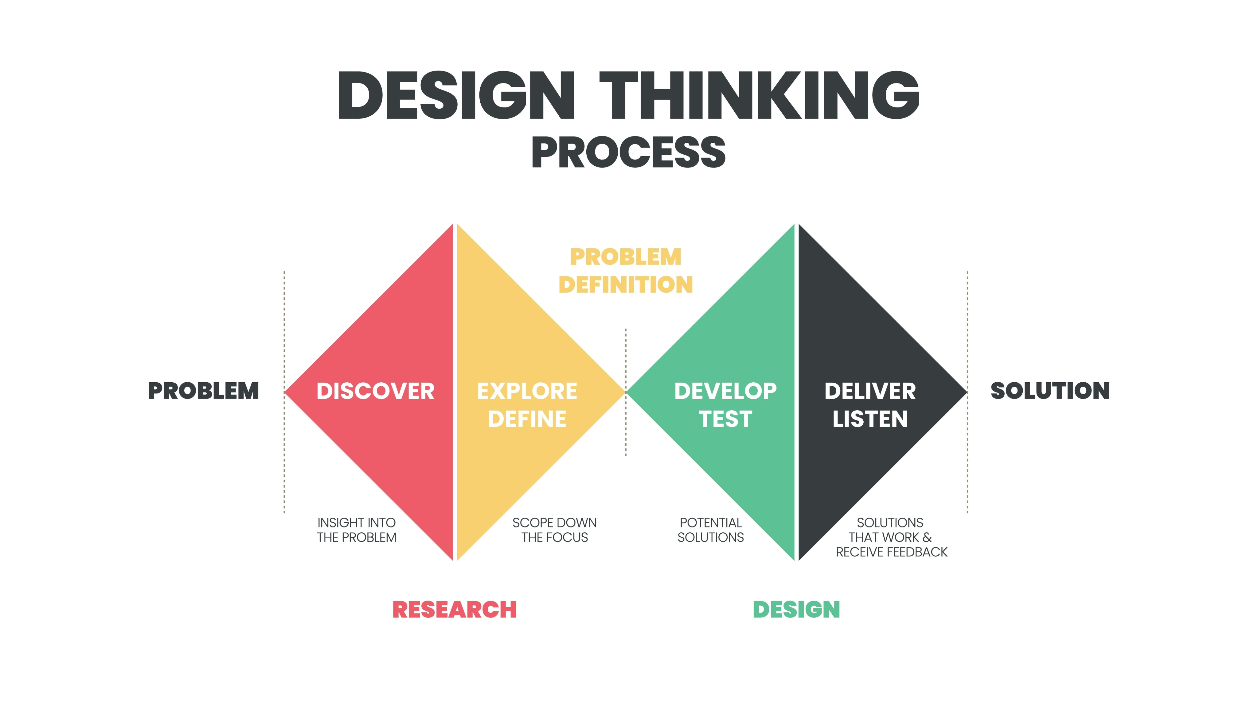
Applied the Double-Diamond design thinking process to create a seamless platform experience.
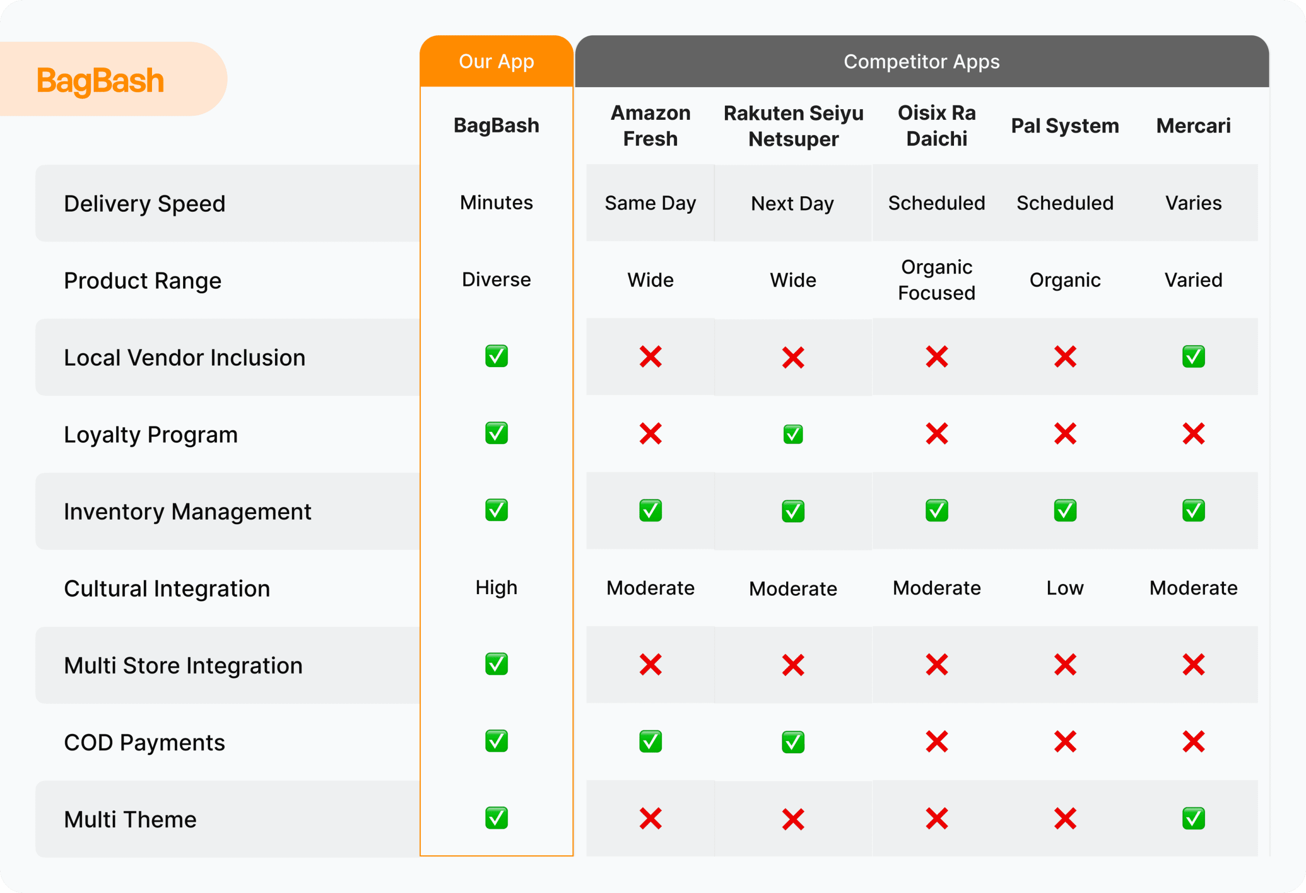
Conducted secondary research through competitor analysis to identify market gaps and best practices.
To gain a deeper understanding of the market and refine our platform, we conducted a competitor analysis of some leading brands in this segment: Amazon Fresh, Rakuten Seiyu Netsuper, Oisix Ra Daichi, and Mercari. This research focused on examining their features, user experience, and overall value proposition, providing a foundation for identifying opportunities to enhance our platform’s offerings.
You can find the detailed findings in the tabs below.
Developing Information Architecture
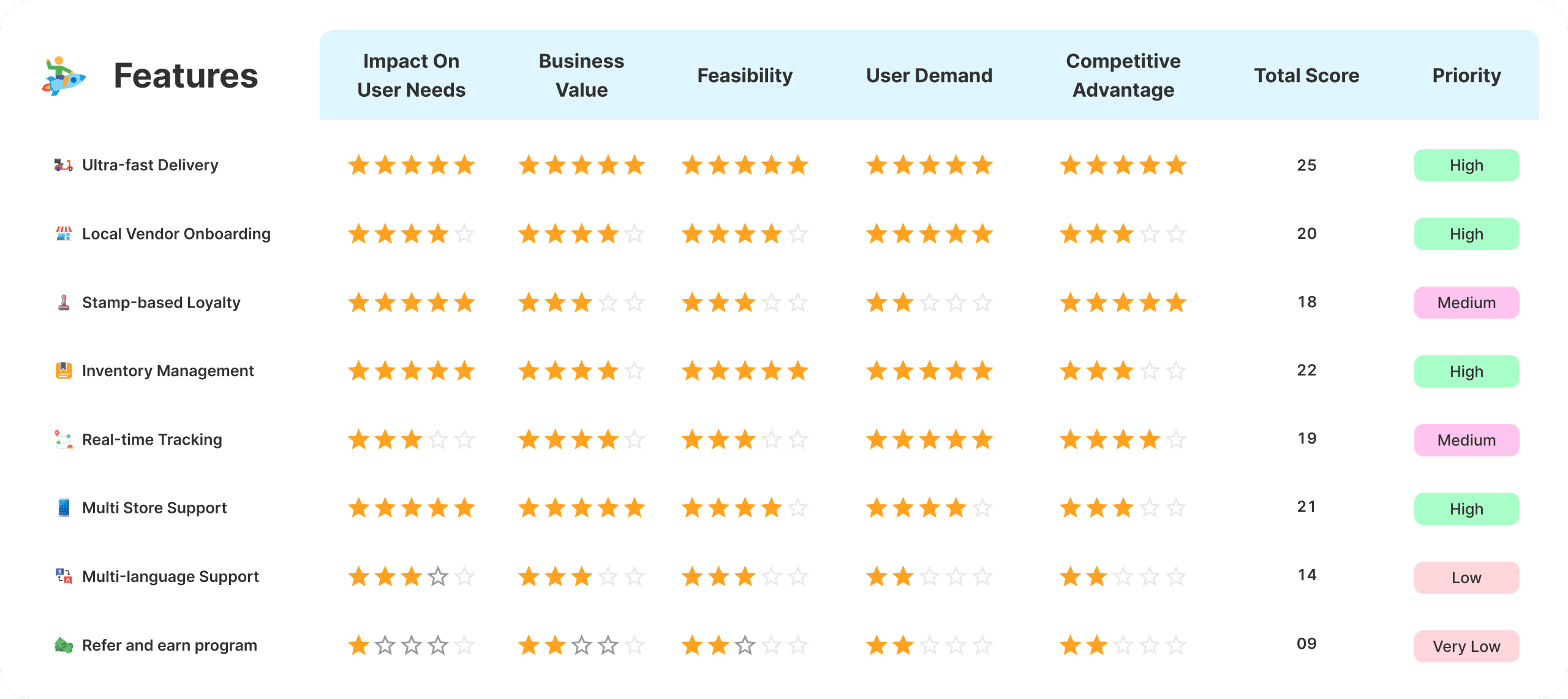
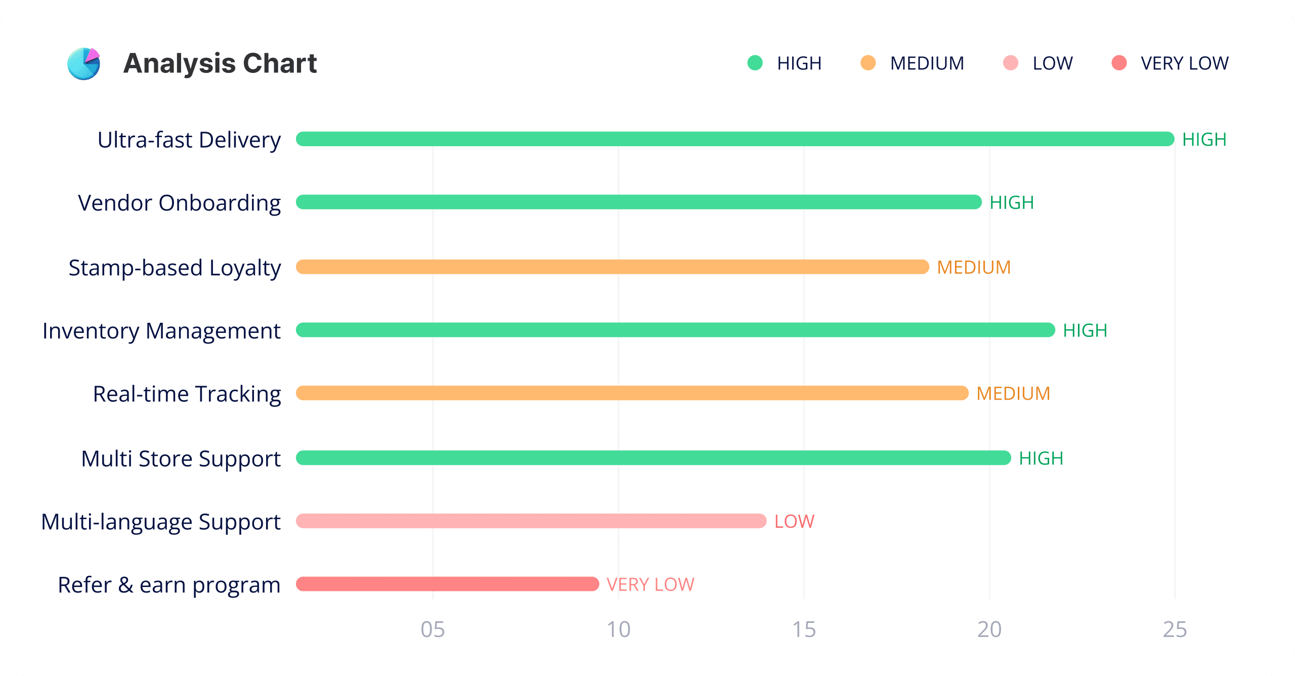
The Information Architecture (IA) was meticulously crafted by me due to limited resources, with periodic reviews and checks from the client side. Throughout the process, I treated myself as a user, considering real-world scenarios and needs to ensure the structure is intuitive and user-friendly. From organizing features and content to grouping them into logical categories, I prioritized usability and clarity. This groundwork aligns with user needs and business objectives, serving as the foundation for all subsequent design decisions.
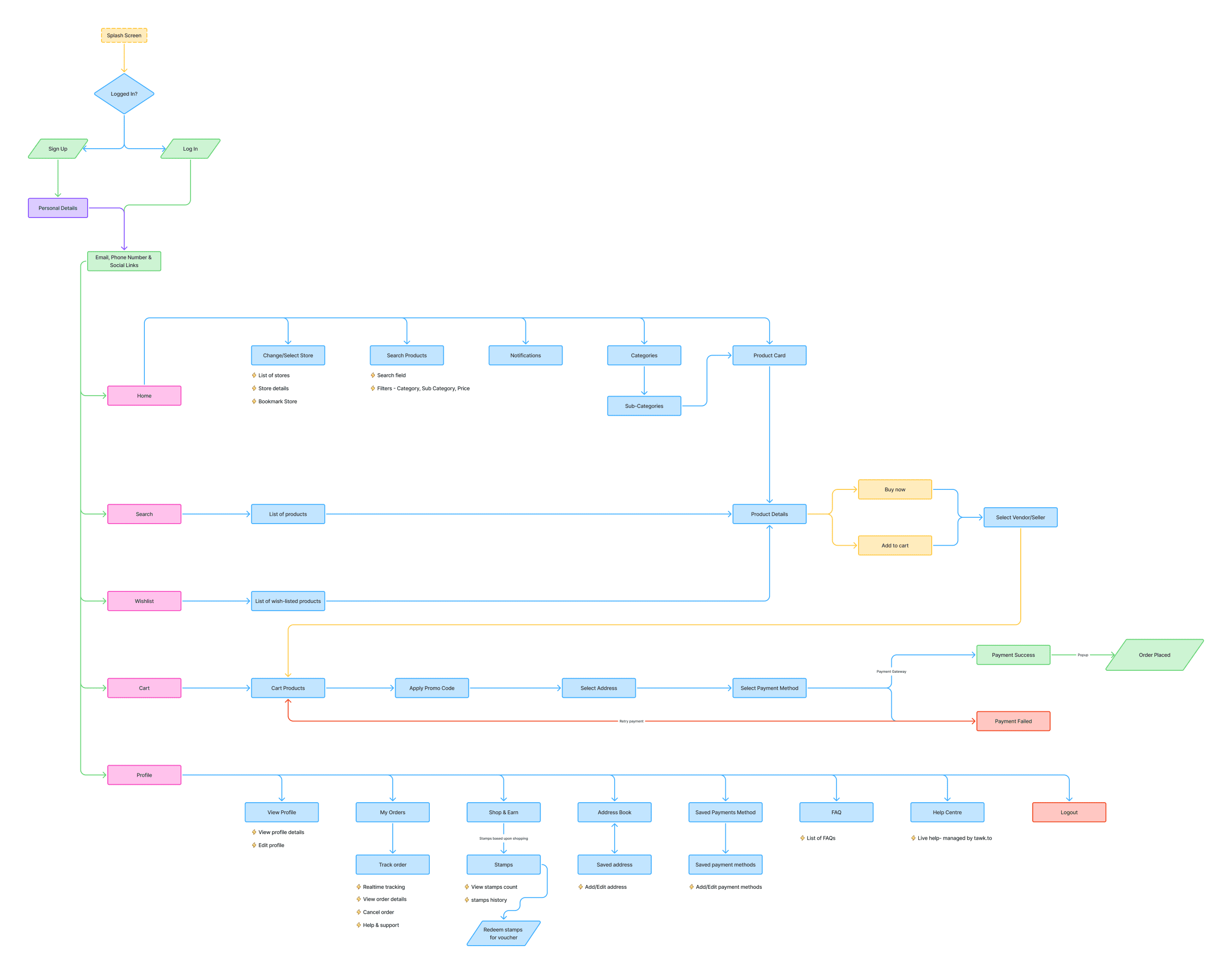
From Sketches to High-Fidelity Wireframes
To visualize the platform’s layout and structure, I started with low-fidelity wireframes on paper, exploring ideas and user flows. Once finalized, I created high-fidelity wireframes on Miro for a polished and interactive representation. This process ensured alignment with the Information Architecture and provided a solid foundation for feedback.
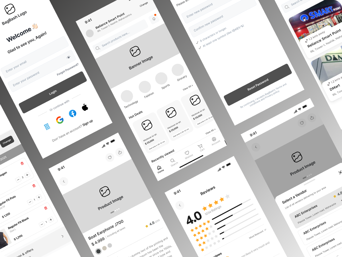
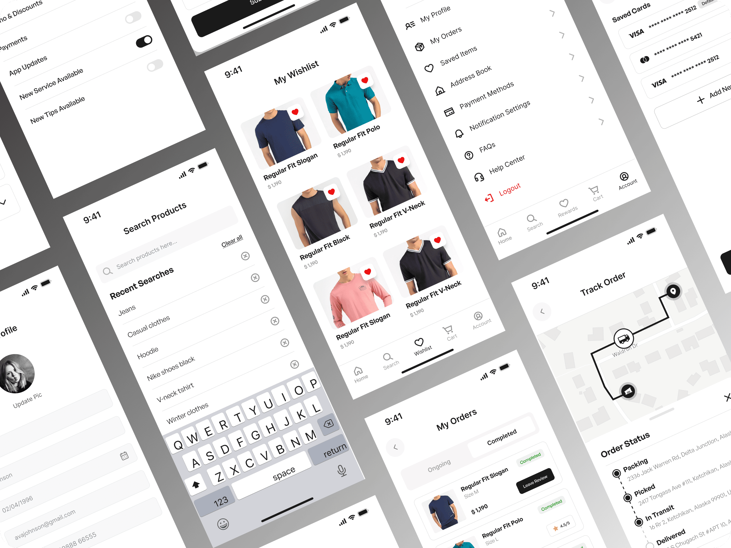
The wireframe designs were refined through an iterative process driven by usability testing and user feedback. By observing users interact with the wireframes & prototypes and gathering their insights, we identified areas for improvement and enhanced the overall experience. These iterations ensured that the design aligns with user needs, resolves pain points, and delivers a seamless and intuitive interface. This user-centered approach allowed us to create a product that is both functional and engaging.
System Usability Scale (SUS) Score
Good
A Framework for Consistent and
Impactful Design
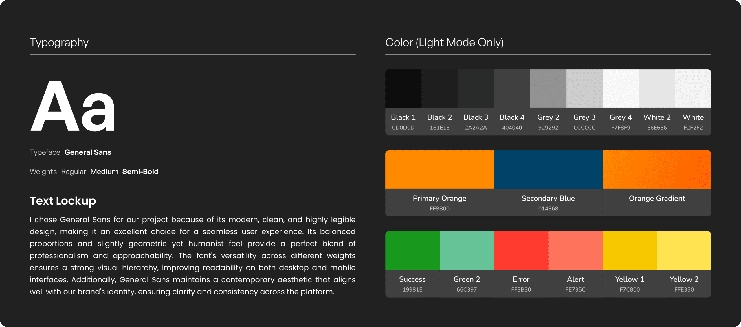
Crafting Engaging and Intuitive Visual Designs
The visual designs were created in Figma, based on the iterated and latest wireframes. These designs focused on translating the structure and functionality into an engaging and visually appealing interface while maintaining consistency with the platform’s goals and user needs. This process ensured a seamless transition from wireframes to high-fidelity designs.
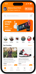


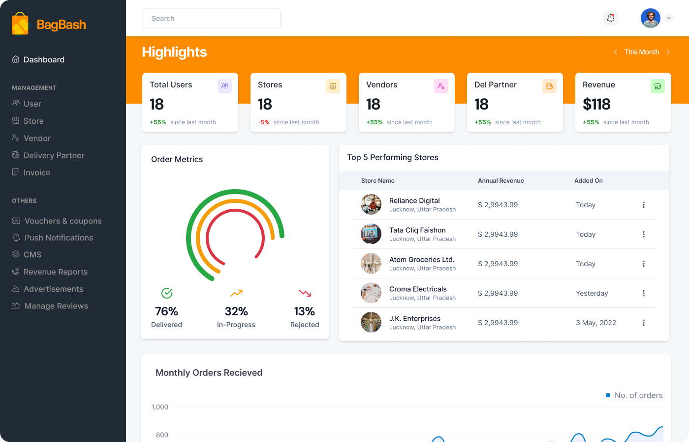
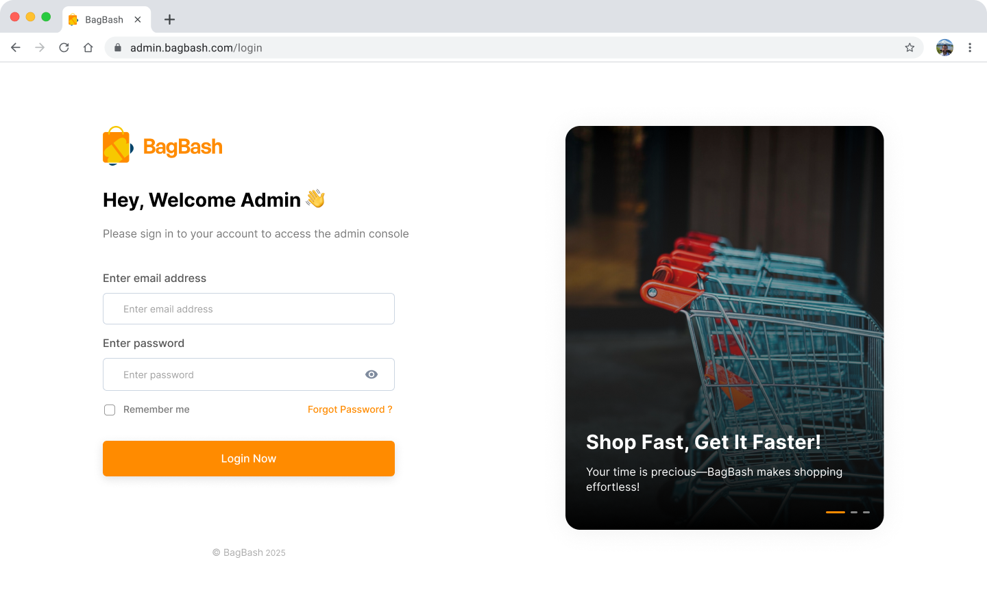
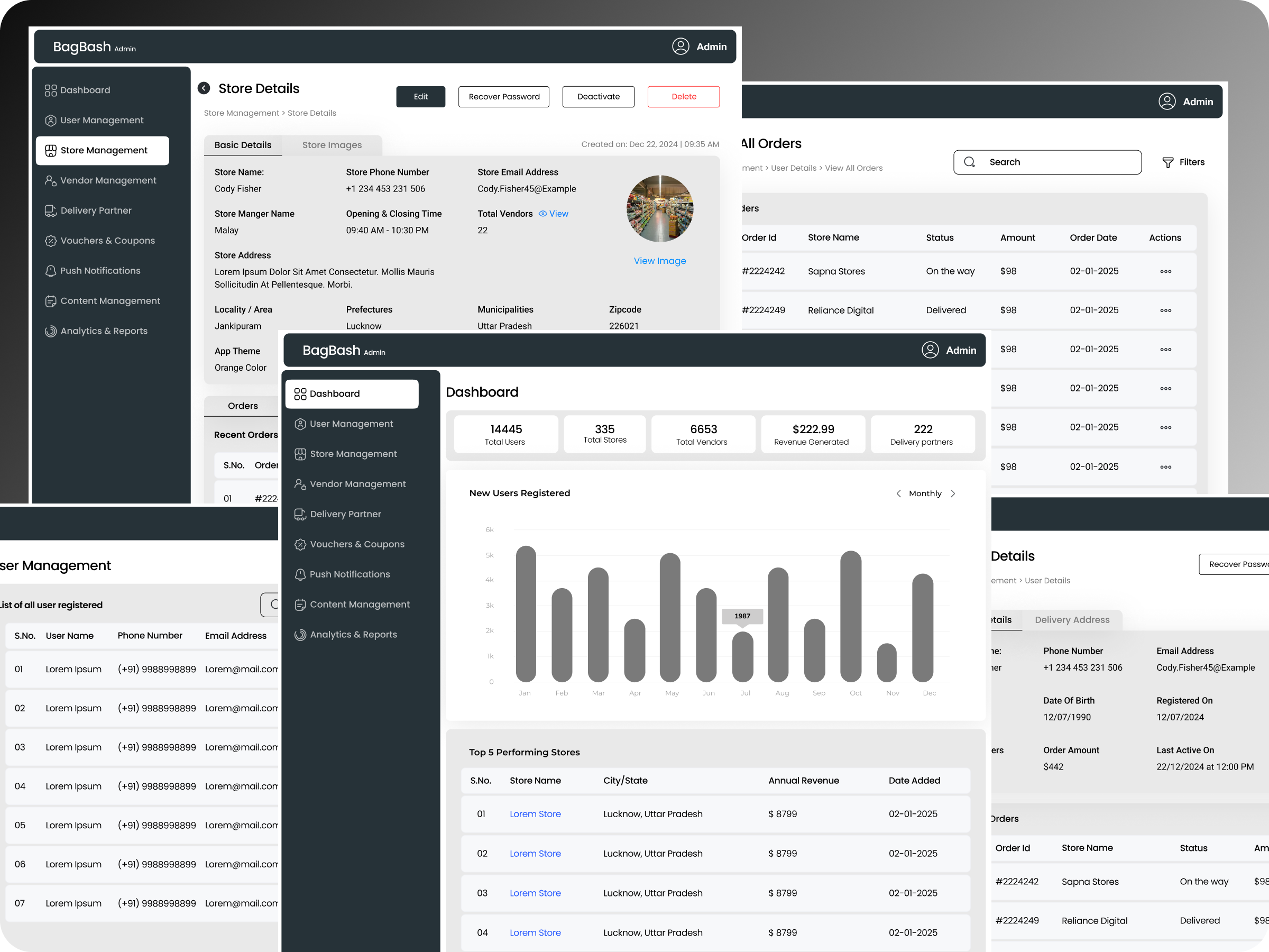
Command center of the app